Furkin

A bold fusion of modern aesthetics and functional design, shaping a distinctive identity across digital and physical spaces.

Client Name
Mark Jackson
Date
May 25, 2025
Deadline
3 weeks
PROJECT OVERVIEW

Frukin is a bold, forward-thinking brand rooted in minimal design and confident expression. We partnered with their team to craft a visual identity that balances raw energy with sleek sophistication. From typography and color systems to digital presence, every touchpoint was designed to feel intentional and powerful.

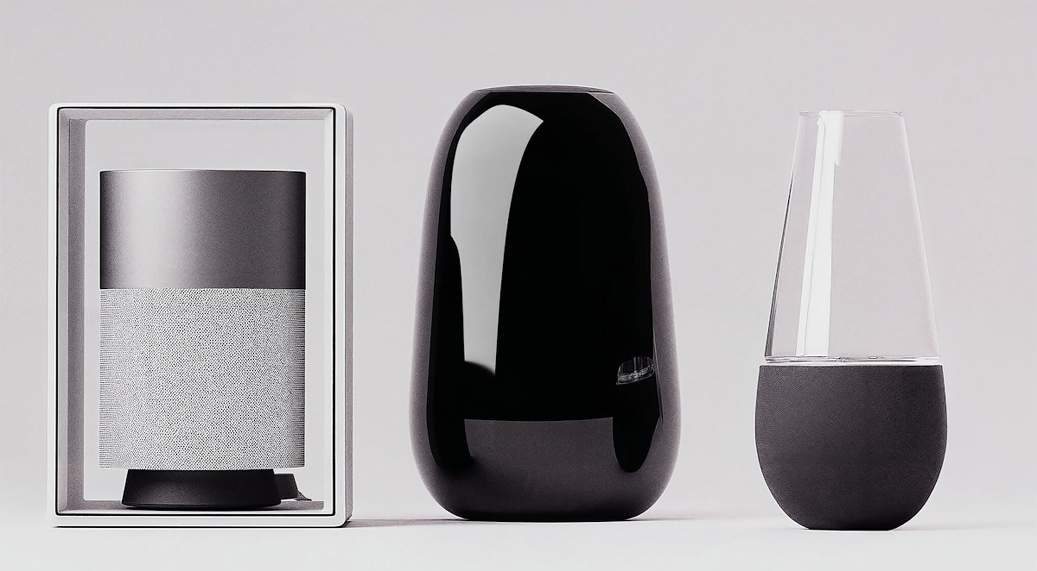
We developed a responsive website that showcases their ethos and product range with clarity and attitude, supported by immersive 3D visuals that bring their concept to life. The result is a cohesive brand experience that stands strong across digital and physical spaces.

BRAND IDENTY

We crafted a branding system that embodies the strength and clarity of FRUKIN’s core values. A custom logotype, sharp sans-serif typography, and a restrained color palette give the brand a confident presence. Each visual element was designed to reflect functionality, grit, and confidence — perfectly aligned with their market position.

PROJECT IMPACT

The Frukin brand launch was met with positive reception across digital platforms. The cohesive branding system and modern web experience have positioned FRUKIN as a standout voice in their category — ready for future campaigns, collaborations, and product expansion.

RESULT

The new identity helped FRUKIN launch with a solid brand foundation. Their web presence is now a powerful tool for storytelling, customer engagement, and long-term growth. The brand has received strong feedback from early customers and partners for its clarity, style, and substance.